Here are a few important projects I am excited to share.


I followed a user-centric approach.
Research
Define
Ideate
Prototype & Test
Design & Launch
Learn
Project Overview

The Product
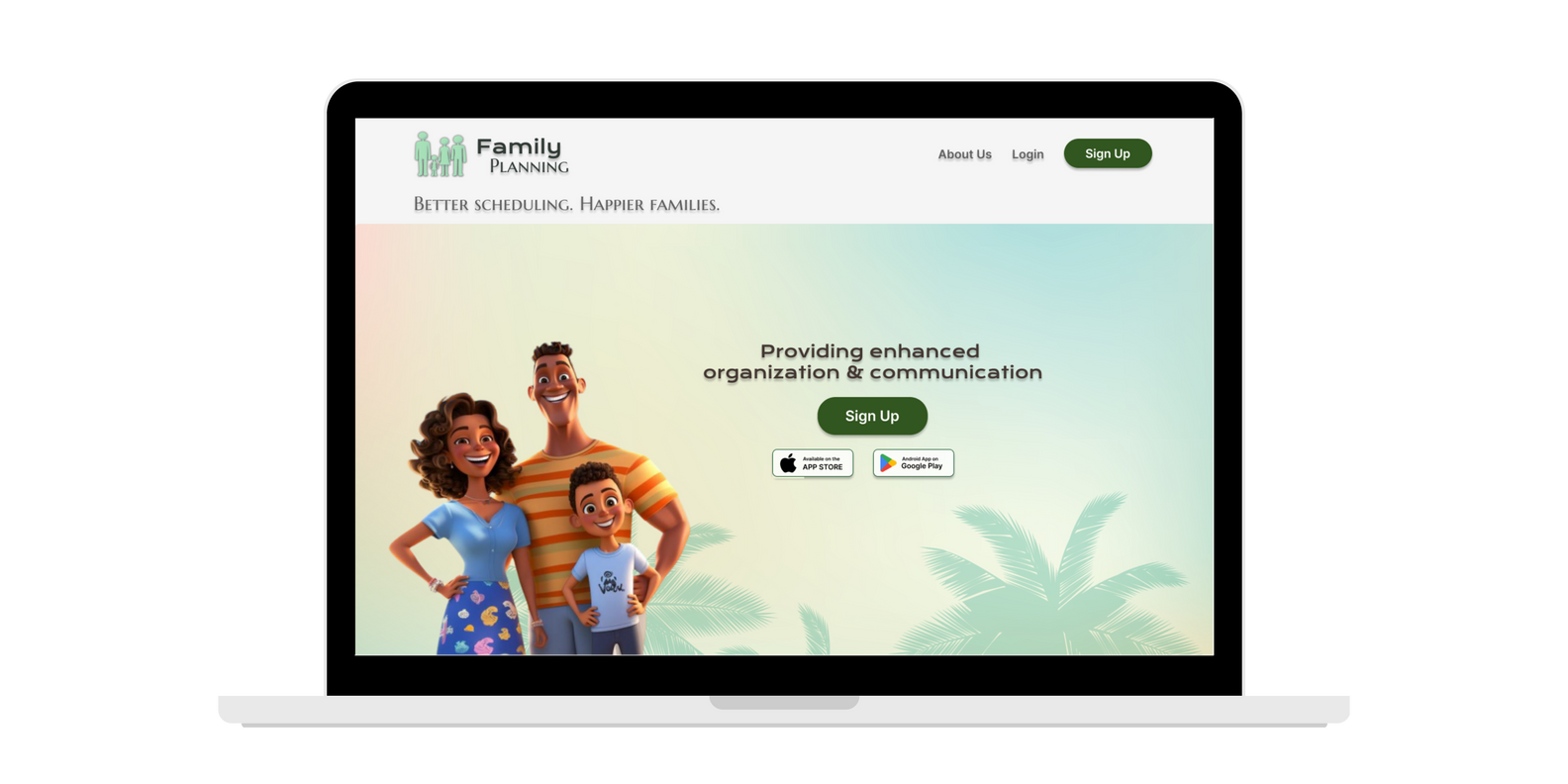
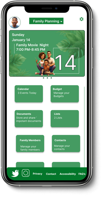
Family planning is a planning and scheduling platform. The typical users are very busy families who need help coordinating their daily activities. Families should be able communicate effectively and organize their entire lives with this responsive website.

Product Duration
January 2024 to Fenryary 2024.
My Role:
UX designer designing a responsive web app for Family Planning from it’s mobile version.
The Problem
The Problem:
Available scheduling websites have missing features and less-than-friendly user interfaces, leaving users underwhelmed and disappointed.
The Goal:
Design a user-friendly responsive website that has functional features.
My Resonsibilities:
As the UX designer for a family planning and scheduling app, I conceptualized and created intuitive user interfaces, ensuring a seamless user experience across all device platforms. I independently conducted user testing to gather feedback and implemented design modifications based on these insights to enhance functionality and user satisfaction.
Understanding
the user
- User research
- Personas
- Problem statements
- User journey maps
User Research: Summary

I conducted user interviews and transformed the insights into empathy maps to deeply comprehend the unique requirements of the primary users of our family planning responsive website.
I discovered that these families often seek a seamless and efficient way to coordinate their daily activities and communicate effectively, aiming to simplify their hectic lives. However, many family planning websites are cluttered and complex, making it challenging for families to find the tools they need quickly.
This complexity often adds to their stress, contradicting the purpose of the website, which is to streamline and organize their lives, enabling them to focus more on quality family time and less on logistical challenges.
User research: pain points
1
2
3
Navigation
Complex and cluttered interfaces make it difficult for families to quickly find necessary tools, wasting valuable time.
Communication
Customization
Ineffective communication features lead to miscommunications and scheduling conflicts, complicating daily family coordination.
Implement robust privacy settings and user control features.
A lack of personalized options fails to meet the unique needs and schedules of individual family members, leading to inefficiency.
4
Information
Overwhelming information and options on planning websites make managing daily activities stressful and time-consuming.
Persona: Emma

Problem statement:
Emma, a dedicated elementary school teacher and mother of two, needs a streamlined, user-friendly family planning tool to manage her family's daily activities and improve communication efficiently. She desires a system that is simple and quick to use, reducing the stress and time spent navigating complex interfaces.

Persona: David
Problem statement:
David, a marketing manager and co-parent, needs an adaptive and straightforward family scheduling tool that accommodates the complexities of a split household. He seeks a planner that facilitates real-time updates and effective communication between him and his ex-wife, ensuring they both stay informed and involved in their teenager’s life.

Paper Wireframes
Next, I sketched out paper wireframes for each screen in my app, keeping the user pain points about navigation, browsing, and checkout flow in mind.
The home screen paper wireframe variations to the right focus on optimizing the browsing experience for users.

Stars were used to mark the elements of each sketch that would be used in the initial digital wireframes.
Paper Wireframes
Screen Size Variation(s)
Because Family Planning’s customers access the site on a variety of different devices, I started to work on designs for additional screen sizes to make sure the site would be fully responsive.


Digital Wireframes
Moving from paper to digital wireframes made it easy to understand how the redesign could help address user pain points and improve the user experience.
Prioritizing useful button locations and visual element placement on the home page was a key part of my strategy.


Digital Wireframe(s)
Size Variations
Easy navigation was a key user need to address in the designs in addition to equipping the app to work with assistive technologies.


Low Fidelity
Prototype
Using the completed set of digital wireframes, I created a low-fidelity prototype. The primary user flow I connected was selecting a category and inputting information, so the prototype could be used in a usability study.


Usability Study Findings
- Participants responded positively to the prototype's basic customization options, stressing the need for more advanced features like color-coded activities and personalized reminders to enhance user engagement and efficiency.
Customization
- Feedback indicated a strong demand for embedded communication tools; users appreciated the prototype's simple messaging function and expressed a desire for more integrated features, such as real-time calendar sharing and schedule updates.
- Despite the prototype's limited functionality, users valued its straightforward layout and intuitive navigation, suggesting that a clean, user-friendly design is crucial for the final product to effectively manage their complex schedules.
Communication
Interface
refining
the Design
- Mockups
- High-fidelity prototype
- Accessibility
Mockups: Original Screen Size
Mockups: Original Screen Size

Mockups: Screen Size Variations


High Fidelity
Prototype
My hi-fi prototype followed the same user flow as the lo-fi prototype, and included the design changes made after the usability study, as well as several changes suggested by other colleagues.

Acessibility Considerations
1
I used headings with different sized text for clear visual hierarchy
2
I used landmarks to help users navigate the site, including users who rely on assistive technologies
3
I designed the site with alt text available on each page for smooth screen reader access
going forward
- Takeaways
- Next steps
Takeaways
Impact:
Users were impressed by the responsive design of the website, noting its consistent performance across various devices and appreciating the flexibility it offered for on-the-go schedule management.
What I Learned:
I learned that even a small design change can have a huge impact on the user experience. The most important takeaway for me is to always focus on the real needs of the user when coming up with design ideas and solutions.
Next Steps
1
2
3
Continuously conduct usability testing with real users to identify any new issues or areas for improvement. Gather feedback and iterate on the design to ensure it remains aligned with evolving user needs and expectations.
Identify any additional areas of need and ideate on new features
Analyze user interaction data and feedback to refine and optimize the user interface and user experience continuously.
Ashley Gaulden | UX Designer
Let’s Connect!
Thank you for taking the time to review my designs! If you would like more information about my work style or designs, please use the contact information below.
Phone: (904) 627-5544 | Email: Gaulden.Ashley29@gmail.com | LinkedIn